
Bank App Investment Feature
Enterprise UX • UX strategy • Financial services • Behavioural design • Personalisation • Data visualisation
Objective
This investment feature was underutilised within HSBC’s mobile app. Customers saw the feature but rarely engaged. The challenge was about building confidence, trust, and usability in digital wealth management.
Target audience
HSBC retail banking customers with moderate investment experience, including busy professionals seeking automated portfolio guidance.
Business goals
Increase engagement and adoption of HSBC’s investment services among the mass-affluent segment.
Strengthen the bank’s position in digital wealth management by offering a differentiated, scalable experience.
Validate a proof of concept that could inform future global rollout.
User goals
Make digital investing simple, transparent, and trustworthy for users intimidated by financial complexity.
Build confidence through personalised, guided experiences that help users understand and control their investments.
Remove friction points that prevent users from exploring or completing an investment journey.
Roll & Responsibilities
Role: Senior UX Designer
Responsibilities: Led end-to-end UX activities including framing the problem space, running user research activities, persona development, journey mapping, design strategy, high-fidelity prototyping, and coordination with the business and engineering teams.
Team: Product owners and managers, tech lead, compliance, user research, data analysts, and design system representatives.
Problem statement
How might we redesign an investment feature for HSBC’s customers so that they feel confident engaging with digital discretionary investments, minimising cognitive load, building trust and encouraging discovery, while working within existing technical constraints, knowledge gaps, and a tight delivery timeline?
Research
Methodology
We ran qualitative research (interviews) with a mix of internal business and beginner and intermediate investors, plus competitive analysis and benchmarking.
Synthesised insights into behavioural personas and mapped needs to HSBC’s business objectives.
Key findings
Discoverability gap
Users saw the feature but skipped it, because of unclear value and their mindset was transactional, not exploratory.
Mismatch in needs
Active traders compared HSBC to tools like Interactive Brokers or Futu HK, preferring more granular control.
Transparency vs complexity
Beginners found fees opaque, language complex, and portfolios hidden in PDFs.
Segmenting user needs
Novice users sought hand-holding and reassurance, experienced users wanted visual clarity and control.
Framing ambiguity to clarity:
Make the feature discoverable and relevant in context.
Reduce friction and intimidation by simplifying decision-making.
Ideation
Approach
With ambiguity defined, I led workshops to explore possible design directions and mapped user journeys. We prioritised ideas into three focus areas:
Personalisation
Dynamic greetings and recommendations based on user profile.
“What-if” investment simulators driven by Quantifeed APIs.
Tailored education content surfaced in context.
Transparency
Unified fee breakdown shown upfront.
Portfolio projections presented visually, not in text-heavy PDFs.
Clear onboarding with fewer steps, fewer unknowns.
Confidence cues
Reinforced trust with plain language copy and visual consistency.
Contextual nudges (e.g. rebalancing notifications) positioned as proactive support, not pressure.
Brand voice used sparingly to reassure, without overwhelming users.
User-journey
Design iteration
We had dozens of concepts, I prioritised these down to what mattered most:
Simplicity, clarity, and confidence.
We deliberately cut features like education libraries (saved as future ideas), to keep the feature focused and achievable within the timeframe.
Design
The design phase was about execution with clarity and intent.
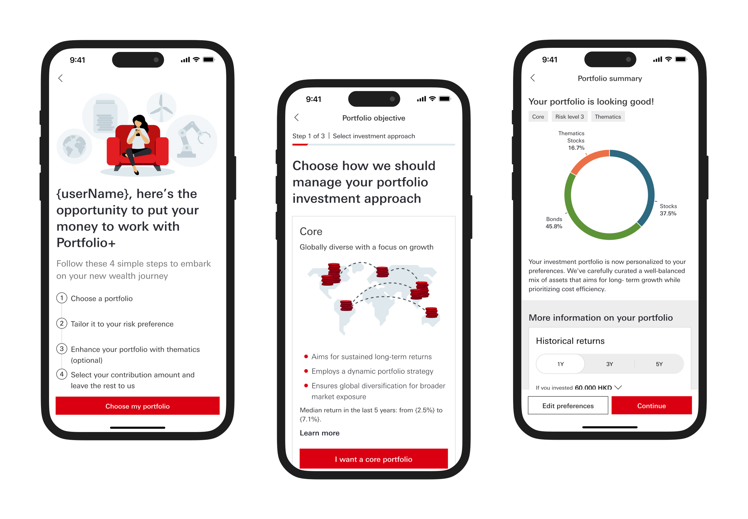
Onboarding flow
Reduced steps significantly by collapsing redundant screens, simplifying content and adding progressive disclosure.
Portfolio sumulator
Allowed users to adjust inputs (time horizon, risk appetite) and see potential outcomes instantly.
Dashboard redesign
Colour-coded allocations, interactive performance recaps, and gain/loss summaries.
Fee transparency
Visualised costs as a single, clear number with contextual explainer.
Guided onboarding
Portfolio
Portfolio analysis
Error states
Everything was designed with one question in mind.
Does this reduce friction and build confidence? If not, it was deprioritised.
User testing
Approach
Format
1-hour moderated, one-on-one prototype testing sessions via Zoom.
Methodology
Qualitative research using an interactive prototype.
Duration
1 week
Participants
Total participants
9 people.
Age range
25-50 (majority in their 30s).
Investor experience
4 beginner investors, 5 intermediate investors.
Customer segments
Primarily HSBC One customers, with some Premier customers.
Digital familiarity
All participants familiar with digital investment tools; some had not previously used robo-advisors.
Demographic insight
The group largely represented mass affluent individuals with a strong preference for digital wealth management solutions.
Findings
Users responded well to clarity in fees and said it made them “trust the product more.”
Portfolio simulators increased confidence, “This is the first time I’ve understood what my money would actually do.”
Drop-offs highlighted in review screens led to reducing steps and improving visual hierarchy.
Error states caused confusion, we redesigned them to explain why errors occurred and how to resolve them.
Feedback integration
Reduced decision steps significantly after observing drop-off at investment review screen.
Revised fee explanation screens with visual aids based on confusion during testing.
Iterated visual hierarchy and interaction microcopy to reinforce user confidence.
Impact
Engagement
Internal UAT showed an increase in feature interaction against baseline.
Efficiency
Decision steps reduced significantly, cutting friction in critical user journeys.
Trust
Qualitative feedback indicated a significant boost in perceived confidence and transparency.
Strategic fit
Established design patterns scalable for future HSBC digital wealth products.
Learnings
Navigating ambiguity
This project started vague “fix adoption”, but through research and prioritisation, we reframed it into a clear, user-centered problem.
Prioritisation
Good design is as much about what you remove as what you add. Prioritisation was a key principle to success.
Assumed knowledge
Design decisions must be explicit and backed by user insights.
Product lens
Thinking beyond screens, I aligned the design to HSBC’s long-term digital wealth strategy.
Conclusion
The feature wasn’t just a redesign, it was a shift from confusion to confidence. By focusing on personalisation, transparency, and trust, we created a digital experience that made investing approachable, scalable, and aligned to both user and business goals.
For users, it transformed uncertainty into clarity, helping them make informed decisions with ease. For HSBC, it proved that simplifying complexity and designing for trust drives measurable engagement and business value.
For me, it reinforced a core belief, in complex, regulated spaces, design’s real job is to simplify, clarify, and curate, building confidence where there was once hesitation.
This project reaffirmed a core principle I carry into every engagement: