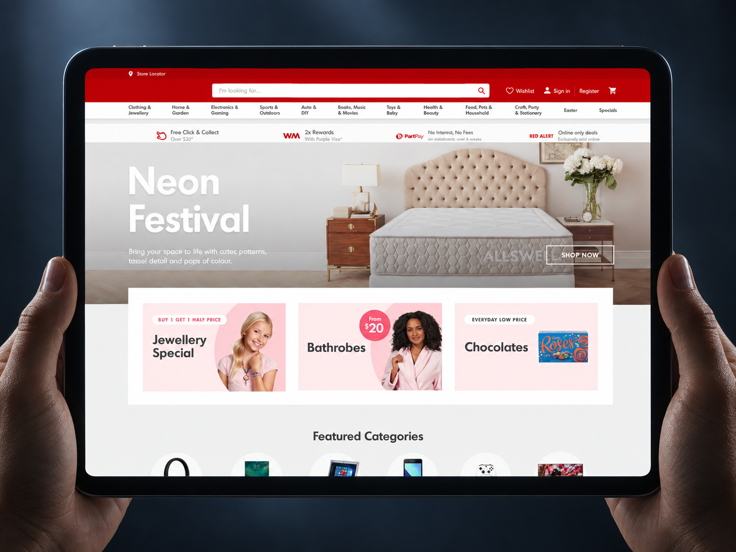
Scaling a Multi-Brand Retail Design System
Context
As a Senior Product Designer in The Warehouse Group’s core design-system team, I helped turn duplicated, brand-specific patterns into a shared system for ecommerce, mobile and retail touchpoints.
Legacy platforms had produced uneven customer and staff experiences and repeated work across design, development, marketing and content. By rolling successful checkout patterns back into the system, later brand implementations moved from six weeks to one week and then one day, a directional internal record, not a controlled benchmark.
Project snapshot
Role: Senior Product Designer and core design-system team member
Status: Adopted through staged product rollouts
Scope: Ecommerce websites, mobile experiences, kiosks and internal tools
Organisation
The Warehouse Group
Collaborators
Design leadership, product, engineering, research, marketing and content
At a glance
The project tested a product-led way to build a design system: prove patterns in a live product, generalise only what held up, then reuse it across brands.
My role
As an early member of the design-system team, I helped shape the system’s product model and turn it into reusable design work.
I audited live experiences and design assets, facilitated cross-functional workshops, developed components and responsive specifications, and helped maintain documentation and version control in Abstract.
I worked with design leadership, product managers, researchers, front-end developers, marketing and content. Delivery outcomes belonged to the wider team; my contribution focused on system design, alignment and reusable interaction patterns.
What the audit changed
The audit covered live ecommerce experiences, existing UI kits and the patterns teams were already shipping. It exposed three practical problems: the same decisions were being remade across brands, designers and developers were working from changing sources, and the system’s non-design users lacked guidance they could use during delivery.
The implication was important: this could not be a design library built for designers alone. It needed to connect visual foundations, component behaviour, implementation guidance, content requirements and a contribution model.
Decision 1
Treat internal teams as system users
UI and UX designers needed trusted components and reusable layout rules. Front-end developers needed predictable responsive behaviour and implementation detail. Marketing and content teams needed speed and flexibility without drifting from brand standards.
That changed what we built. Alongside UI kits, the roadmap included wireframe components, online behaviour examples, implementation and content specifications, and code snippets. The system became a product for the people creating customer and staff experiences—not only a library of finished screens.


Decision 2
Prove patterns in a flagship product
Rather than designing the full system in isolation, the team used a flagship product to test patterns under real delivery constraints. The approach was simple: use a live product, roll what worked back into the system, then carry the reusable parts into other products.
This created a useful trade-off. We accepted that the first implementation would contain product-specific decisions, then separated reusable behaviour from brand or workflow detail before documenting it.
What became reusable
Shared foundations: Colour, typography, spacing, hierarchy and interaction states.
Component patterns: Responsive anatomy, behaviour, content limits and implementation guidance.
Multi-brand variants: Common structure and behaviour with controlled differences in type, colour and expression.
Governance: Weekly Power Hours, Tuesday critiques and regular backlog refinement kept the system connected to live work.


Decision 3
Validate adaptability, not only visual consistency
A content workshop asked cross-functional teams to assemble desktop and mobile homepages from prebuilt components, then respond to late changes such as free-delivery and spend-and-save requirements.
The components passed the core task, but the adaptations were more valuable than a simple approval. Participants preserved the main price-lockup patterns while exposing needs for lifestyle-image heroes, skinny banners, four-button modules and stronger category navigation.

Impact
Delivery acceleration
The internal rollout record shows a clear operational pattern: the Red checkout took six weeks to redesign, prototype and test; the T7 checkout took one week; and the Blue checkout took one day.
The projects were not identical, so I treat this as directional evidence rather than a controlled comparison. It nevertheless shows the reuse advantage the system was intended to create.
System and team outcomes
Shared UI kits, component specifications and version control reduced the need to start from scratch. The governance cadence gave teams a place to review changing patterns, identify system impact and break contribution work into deliverable tasks.
The most defensible outcome is capability: the team established a repeatable way to test a pattern in context, generalise it, document it and reuse it across brands.
Lessons learned
The system was still evolving. The roadmap included gaps in online documentation, implementation specifications and code examples, and the delivery timings did not control for differences between rollouts.
Two lessons have stayed with me. First, governance is design work: components remain useful only when ownership and decision paths are clear. Second, adoption depends on trust. Involving designers, developers, marketing and content produced a more practical system than a library created in isolation.
Reflection
This project changed how I approach platform work. A design system is not the polished library at the end, it is the feedback loop between live products, shared decisions and the people who use the system to deliver.
My strongest contribution was helping make that loop tangible, from audit and workshops to responsive component detail, version control and cross-brand reuse.