
Developer Experience Dashboard
Developer experience • Enterprise SaaS • Data visualisation • MVP design • B2B product design • Actionable insights
Problem statement
Business goals
Increase returning Team Weekly Active Users (WAU) for Development Managers and above from ~20% to ~25%, with a stretch goal of 30%.
Improve adoption and engagement of the Team Dashboard area by providing clear, actionable insights (measured by feature usage and interaction depth).
(Assumption) Reduce time spent by managers assembling ad-hoc reports and custom dashboards.
User goals
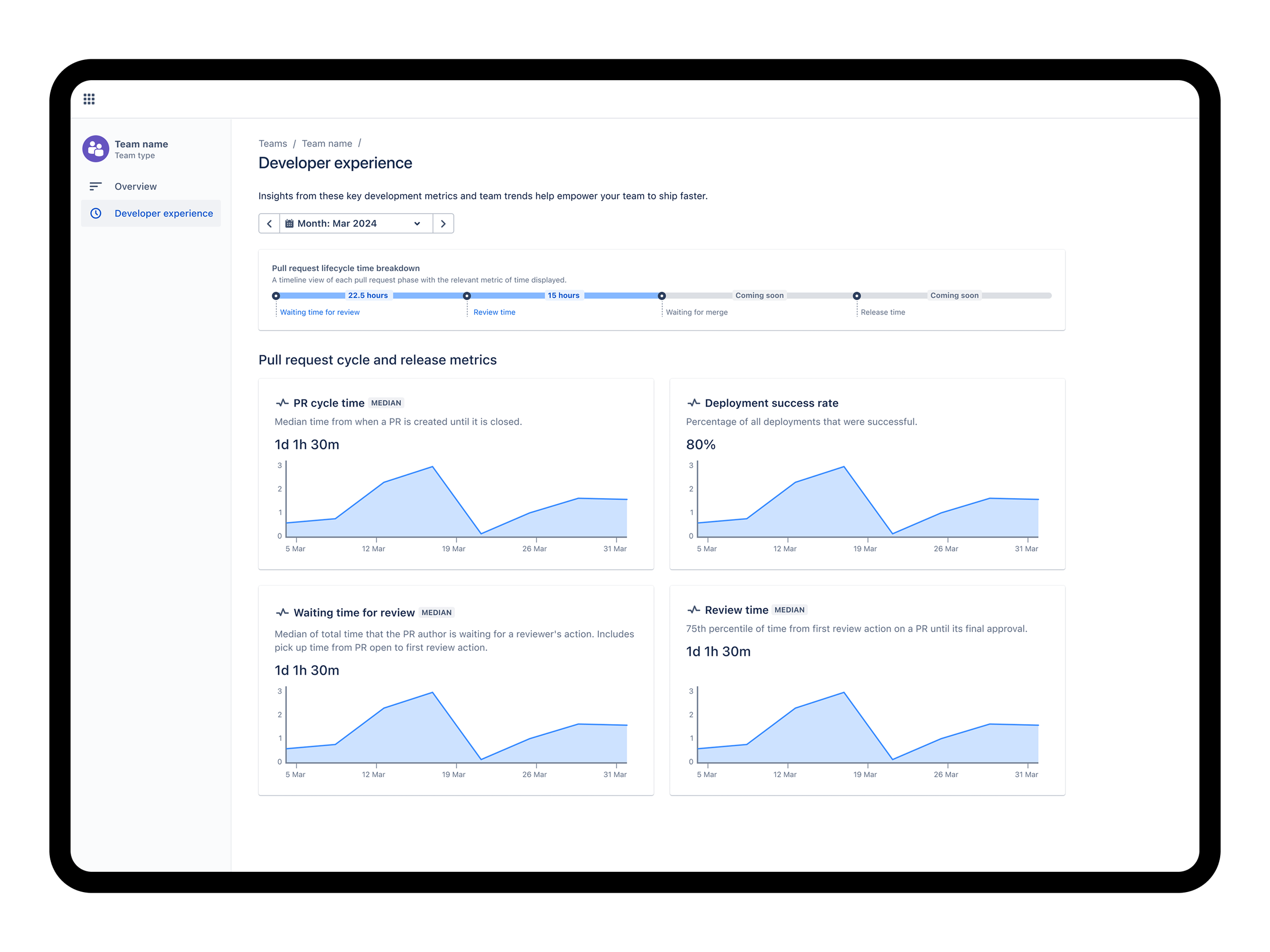
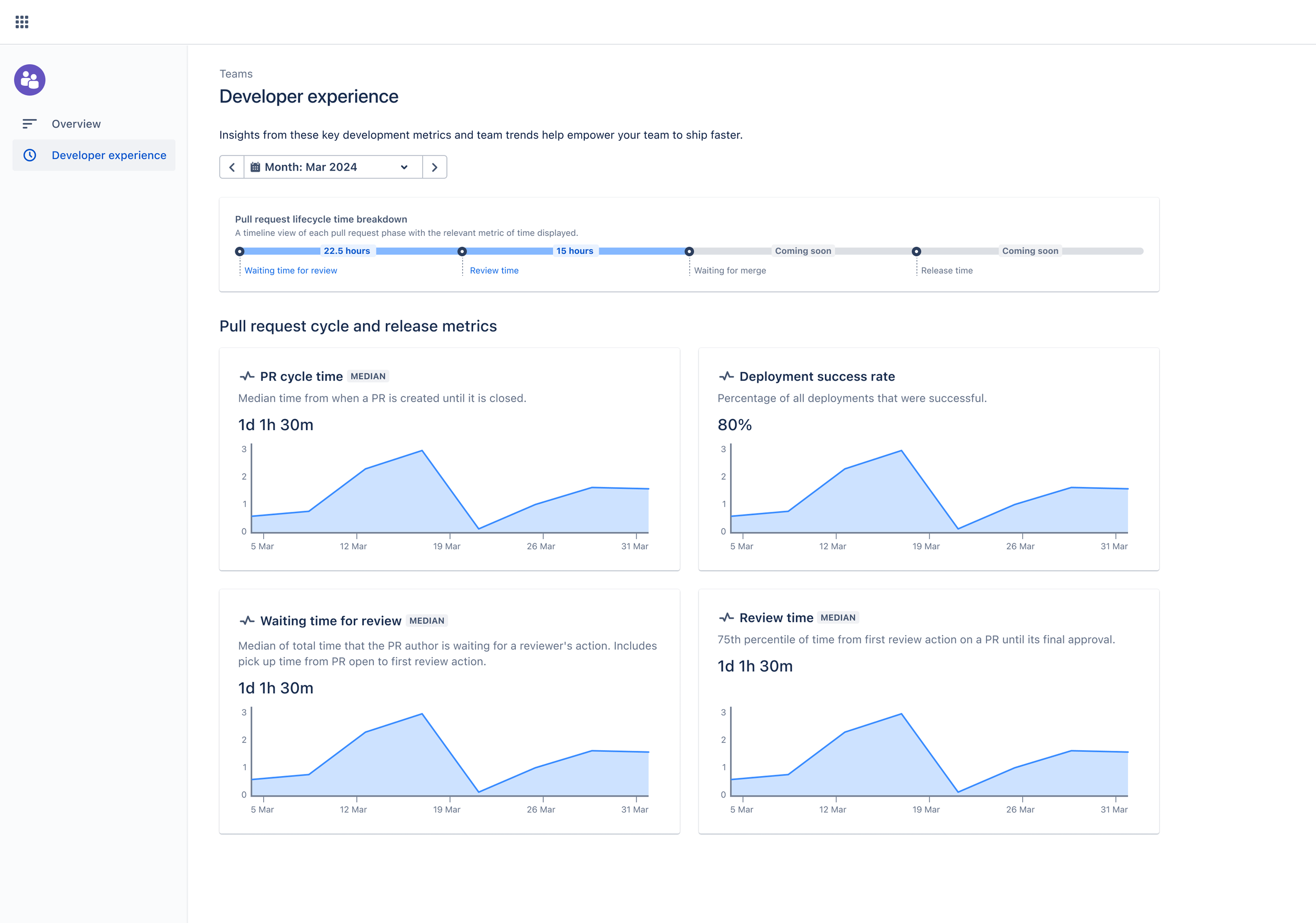
Give Engineering Managers a single, trustworthy view of four core metrics: Deployment Success Rate, PR Cycle Time, Review Time, and Waiting Time for Review.
Reduce time to detect and act on bottlenecks (long-running PRs or slow review cycles).
Increase managers’ confidence in their understanding of team health and productivity trends over time.
How might we provide engineering managers with a centralised, real-time view of team operational performance, covering metrics like PR cycle time, waiting time for reviews, and deployment success rates, so that they can quickly identify and resolve bottlenecks, taking into account the limitations of existing data sources, varying levels of stakeholder alignment?
Objective
Compass is a developer productivity platform used by engineering teams to understand how they ship software. Engineering managers were struggling to piece together meaningful productivity signals (PR cycle time, review delays, deployment health) across multiple tools. We designed and shipped the first iteration of a Developer Experience Dashboard to centralise key metrics and help managers identify bottlenecks and improve team health.
Target audience
Primary – Engineering and development managers looking for quick insights into team productivity, operational health, and trends over time.
Secondary – Individual contributors benefiting from clearer metrics and prompts to expedite code reviews and deployments.
Role & responsibilities
Role: Lead Product Designer
Scope:
Conducted user research to pinpoint managerial pain points and goals for productivity tracking
Led cross-functional discussions with product managers and developers to define core metrics
Created user flows, wireframes, and interactive prototypes for the MVP dashboard
Organised and analysed usability testing sessions, integrating feedback into iterative design refinements
Ensured design consistency with the overall team dashboard and newly introduced developer experience dashboard
Collaborators:
Product Manager (strategy & metrics), Engineering Lead (architecture, OneSight integration), front-end engineers, data/analytics partner.
Decision authority
Led UX decisions end-to-end, co-owned scope and prioritisation with PM, aligned with Engineering on technical feasibility and phased delivery.
Research
Methodology
User interviews
Engaged with over a dozen Engineering Managers to understand their specific pain points, from identifying long-running PRs to calculating deployment success rates.
Analytics
Mined data from existing dashboards and tools, confirming that lack of integrated insights was a major frustration.
Stakeholder workshops
Brought together product owners, design, and engineering to brainstorm which metrics would deliver the most immediate value.
Key findings
Consolidated data
Many managers cobbled together homemade dashboards, signifying a large gap in available tooling.
Actionable insights
Merely presenting metrics wasn’t enough, managers wanted in-dashboard prompts to help them take the next step (e.g., addressing an overdue PR).
Focus on trends
Manager level users crave insights on how to remove bottlenecks and improve developer well-being, not just raw metrics.
Challenges and constraints
Technical complexity
Aggregating data from multiple repository and deployment systems to deliver real-time insights.
Stakeholder alignment
Balancing the needs of engineering managers, product managers, and end-user developers.
Resource limitations
With parallel projects in flight, our team had to operate under tight timelines for prototyping, testing, and iterating.
Ideation
Conducted brainstorming workshops to prioritise features that would yield MVP customer value, e.g. shipping the feature quickly but effectively.
Aligned the new feature with the existing team dashboard, ensuring synergy for both managers and developers.
Designed initial wireframes to visualise how the four key metrics would be displayed and how managers could drill down from high-level stats to detailed views.
User-journey
Design iteration
Design
Challenges
Mixed granularity
Some managers wanted an at-a-glance overview, while others needed a detailed breakdown for each team member.
Prompting action
Moving from passive reporting to an interactive experience that highlights potential bottlenecks (e.g. 3 pull requests stuck for over 7 days).
Data integration
Ensuring the new feature could ingest and interpret data efficiently for real-time metrics.
Solutions
Layered information architecture
The feature uses a tiered view, top-level metrics, plus drill down reports for deeper insights (e.g. PR review time).
Action cards
Each metric tile includes prompts that link directly to the relevant section or tool, reducing friction and accelerating intervention.
Consistent design language
Reused patterns from the team dashboard to keep the user experience cohesive and intuitive.
Developer experience dashboard

Open pull requests tab view
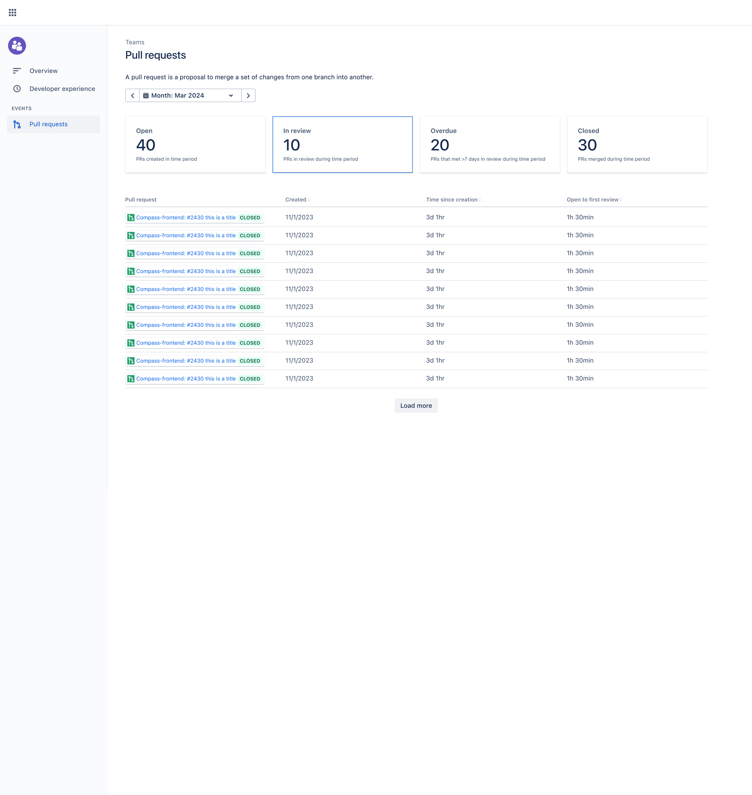
In review pull requests tab view
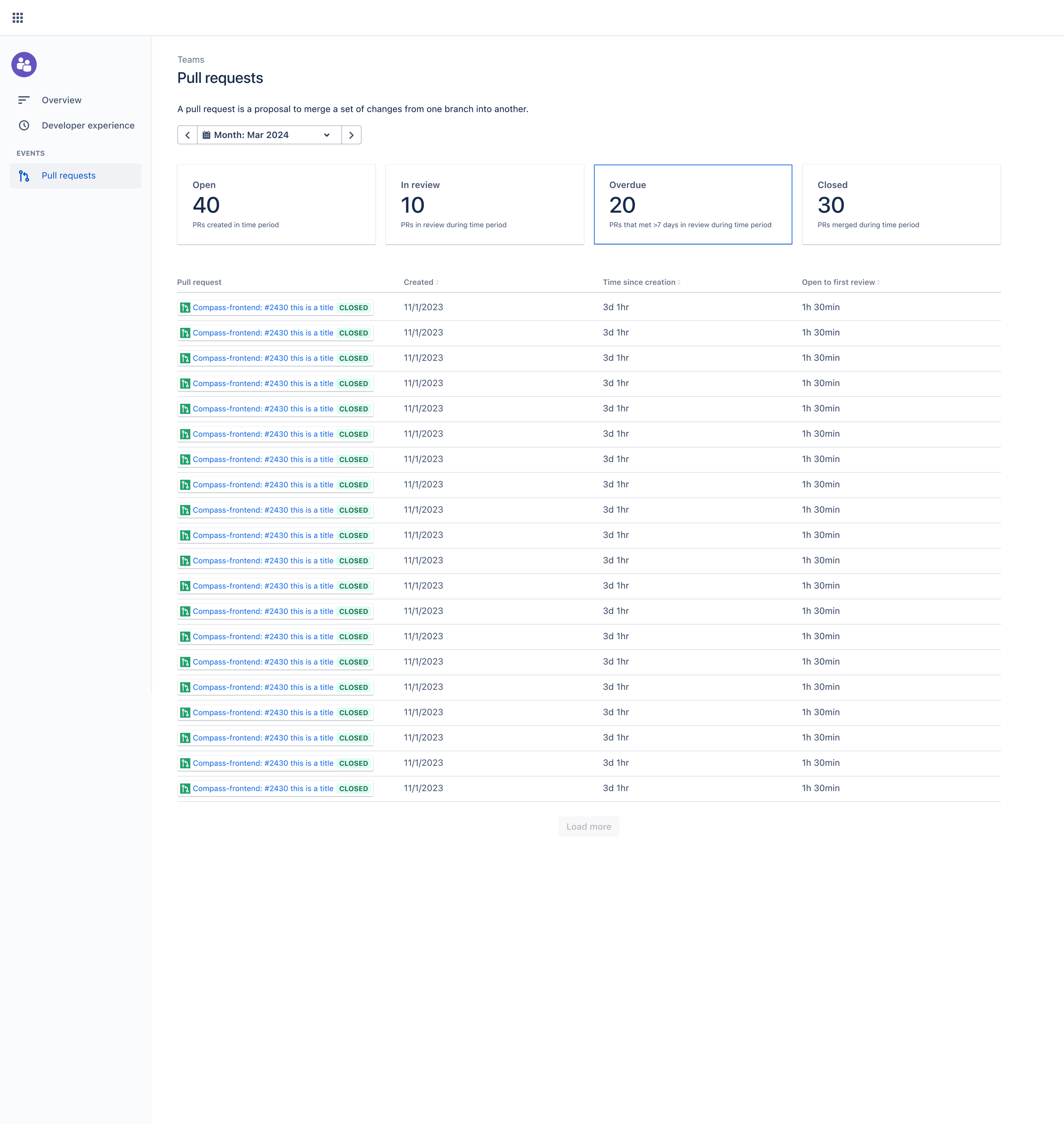
Overdue pull requests tab view

Closed pull request tab view
User testing
Testing methodology
Usability tests
Conducted remote testing sessions with development managers to gauge dashboard clarity and discoverability of insights.
Feedback integration
Expanded filtering options after managers asked for more granular filters by team, repository, and date range.
Incorporated additional textual descriptions to clarify each metric’s calculation, helping users trust and act upon the displayed data.
Impact
Quantitative results
Returning team weekly active usage (WAU) indicated an increase, meeting our initial goal. Early adopters showed signs of pushing towards the stretch goal. Metrics around review bottlenecks indicated quicker resolutions, with some teams halving their average waiting time for review.
Qualitative feedback
Managers praised the dashboard for offering clear, actionable insights. Users noted that being able to see “how we’re trending over time” gave them confidence to proactively address productivity issues before they became systemic problems.
Customer value
The four initial metrics, deployment success rate, PR cycle time, review time, and waiting time, provided the core insights managers need to enhance team productivity. Clear visual cues and action prompts transform previously static data into a springboard for continuous improvement.
Learnings
Early and frequent testing is crucial
Rapid feedback loops ensured design decisions stayed aligned with real-world workflows.
Context and action is key
Merely listing metrics doesn’t drive engagement, pairing them with practical recommendations does.
Iterate in milestones
By shipping the feature iteratively, we balanced speed-to-market with the need for a robust, user-validated solution.
Conclusion
The Developer Experience Dashboard demonstrates how targeted, actionable metrics can meaningfully enhance team productivity and overall operational health. By focusing on the four MVP metrics and integrating user feedback, we not only achieved a measurable uptick in returning WAU among development managers but also empowered teams to identify and address bottlenecks proactively.
This feature underscores the principle that design elevates data into insight, transforming metrics into meaningful actions that drive continuous improvement. Through consistent testing, stakeholder alignment, and a user-centric lens, the Developer Experience Dashboard set the foundation for an evolving suite of features that will further improve how teams ship software.